
Uplift
Motivating donors to give more to causes that matter to them.
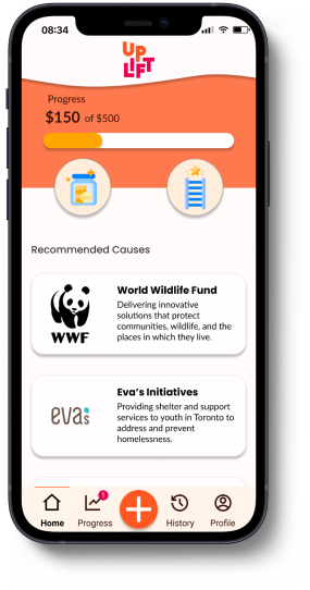
Uplift is an iOS app that helps young adults prioritize and keep track of charitable giving. It allows users to set goals, track progress, view insights, and earn achievements.
Overview
Project Type: Academic
Timeline: 10 weeks
Roles: UX Researcher, Design Strategy, UX/UI Designer
Tools: Figma, InVision
Project Brief
From September to December 2021, I completed a full-time UX design bootcamp with BrainStation and obtained a diploma in UX Design. Over the course of the bootcamp, I completed an end-to-end capstone project which involved identifying a human-centered problem, and designing a digital solution.
aPPROACHING THE CHALLENGE
To tackle this challenge, I followed a design-thinking framework. This user-centered approach is non-linear and allows for innovation through multiple rounds of feedback and iteration.

Empathize
Secondary Research
Primary Research

Define
Persona
Ideate
Task Flows
Prototype
Low-fi Wireframes
Mid-fi Prototype
Test
Iterations
Refine
Hi-Fi Prototype
Marketing Website
Empathize
pROBLEM sPACE
Charitable Giving and the Pandemic
The COVID-19 pandemic affected many industries - including the charitable sector. Reports suggest a growing gap between demand and capacity for services offered by Canadian charities.
This inspired me to look deeper into the barriers preventing people from donating
sECONDARY Research
The Uncertain Future of Giving in Canada
The majority of donations in Canada are made by older generations. Unfortunately, younger generations are not keeping pace, their donation rates and average donations are low and increasing very slowly compared to previous generations. In order to ensure the future of charitable giving in Canada, it's important to engage younger generations.
Even small increases in the proportion of Canadians who give and/or small increases in average donation amounts would have an enormous impact.
- Thirty Years of Giving in Canada
Millennial Giving Habits
Millennials have high expectations of the charities they support and rely on friends, social media and reports from the organization to measure effectiveness. They value trust, authenticity and transparency when donating to a cause, so it's important that they're able to access this information easily.
Design Challenge
How might we give Millennials and Gen Zs confidence that charities align with their values in order to encourage charitable giving?
Primary research
Talking to Millennials
In order to better understand the barriers Millennials face when it comes to charitable giving, I conducted 5 interviews with Canadians between 21 and 31 years old. I wanted to understand:
- Their current donation habits - where do they donate, how often, and are they satisfied?
- How they make decisions about where to make donations?
- What makes a charitable organization trustworthy ?
- Barriers, if any, to making monetary contributions
- The role that peers play in donation habits
After completing the interviews, I compiled a list of pain points, motivations and behaviours expressed by my interviewees. From this list, I identified the following themes and insights:

Personal Connections
Users tend to support causes that are personal to them, or local causes that they can see the impact of first-hand.
Responsibility to Help
Users believe that donating to those in need is important for addressing injustices and that they have a responsibility to do so.

Finances & Budget
Financial status impacts how much users donate, but all users felt like they could donate more. A common barrier to giving more was not prioritizing charitable giving in their budget.
Visible Impact
Users are motivated to donate when they can see the impact their donation makes. They want to hear personal stories and donate to specific projects as opposed to open-ended campaigns.
Trust & Transparency
Users value transparency. They want to know exactly what charities do, what they stand for and how their donations are being used.
Social Media
Users rely on social media, particularly Instagram, to discover and stay up to date with charities. However, these updates can get lost amongst other accounts they follow.
Key Insight: Finances & Budget
I assumed that users have a hard time finding causes that align with their values and that distrust in organizations was a major barrier to donating more.
My primary research suggests that users have the resources to find causes that align with their values. While users value trust & transparency, it did not seem to be a major barrier.
Instead, all users felt like they could give more, but that budgeting properly for charitable giving was a barrier.
Define
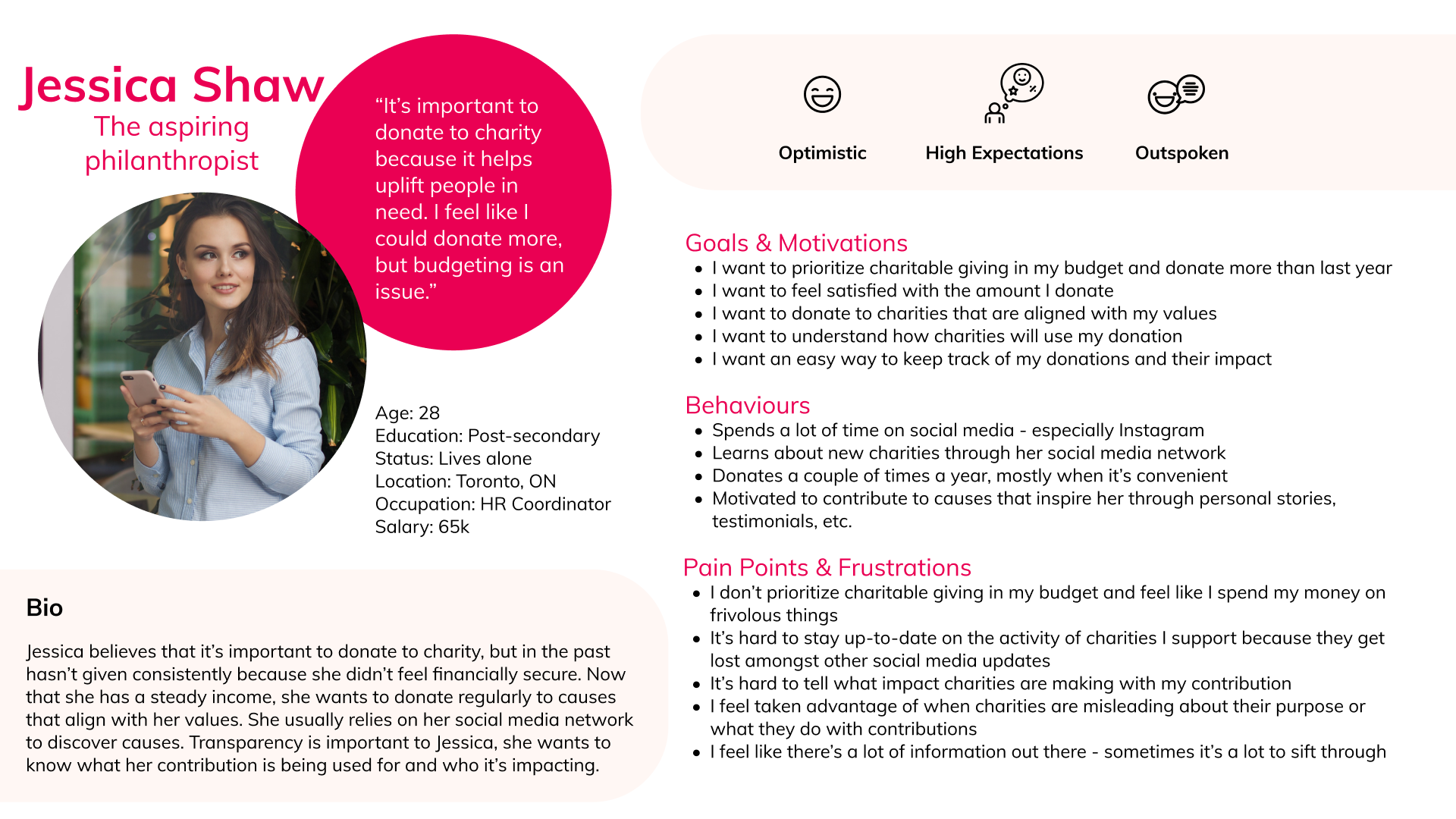
Persona
Who are we designing for?
I took the information I gathered during the interview stage and synthesized it to create a persona. This allowed me to keep my users’ perspective at the forefront of my design process.
Experience Mapping
Opportunities for Design
By understanding Jessica’s journey, I can get a better understanding of the stages in which an intervention might be warranted.

Revised design challenge
Challenging my Assumptions
Once I had my persona, Jessica, and her journey in mind, I revisited my design challenge and initial "How Might We." Before conducting primary research, I assumed that my users' primary need was finding charities that aligned with their values. After interviewing users, I found that users already have the tools to help them identify causes that align with their values. The main barrier to donating more was not budgeting properly for charitable contributions. With this key insight in mind, I decided to revise my design challenge to better address the needs of my user.
Revised Design Challenge
How might we help Millennials and Gen Zs prioritize charitable giving in their budget, in order to help them feel satisfied with their contributions.
Ideate
user stories & task flows
What are the functional needs of my user?
With my revised HMW in mind, I began authoring user stories to identify the main tasks that my users might want to perform.

Primary Core Epic: Goal Setting
I selected “Goal Setting” as the core epic because it is a foundational task. A goal will help users focus on their charitable giving, and allow them to prioritize it in their budget.

Create a New Goal Task Flow
Epic: Goal Setting
Persona: Aspiring Philanthropist
Main Task: Create a New Goal
Subtasks: Specify Details, Select Important Causes, Review Goal
User Stories:
As an aspiring philanthropist, I want to create a charitable giving plan, so that I can meet my goals.

Secondary Core Epic: Contribution Tracking
I selected “Contribution Tracking” as a second core epic, because it allows users to track their habits. Tracking leads to stats, trends and insights related to giving habits. This can be leveraged to motivate and encourage users to prioritize giving in their routines.
Track a Contribution Task Flow
Epic: Contribution Tracking
Persona: Aspiring Philanthropist
Main Task: Track a Contribution
Subtasks: Specify Details
User Stories:
As an aspiring philanthropist, I want to manually track contributions, so that I can keep track of all of my contributions

Prototype
Sketches and wireframes
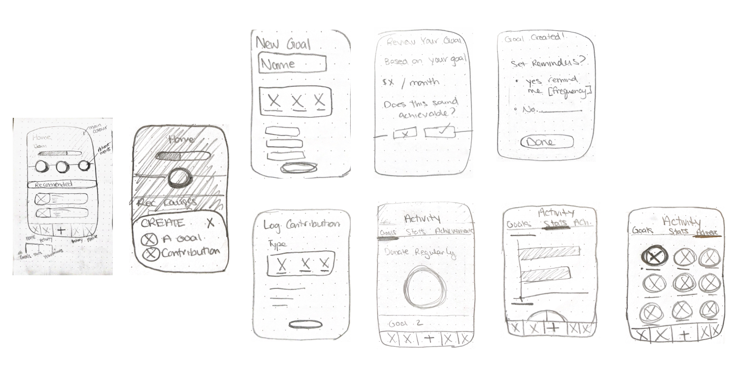
Exploratory Sketches
With my primary and secondary task flows, I was ready to start sketching out low-fidelity solutions. I drew inspiration from goal-driven apps such as Nike Training, MyFitnessPal and Strides, budget tracking apps like Mint, widely used apps like YouTube, as well as Dribbble.
Homepage
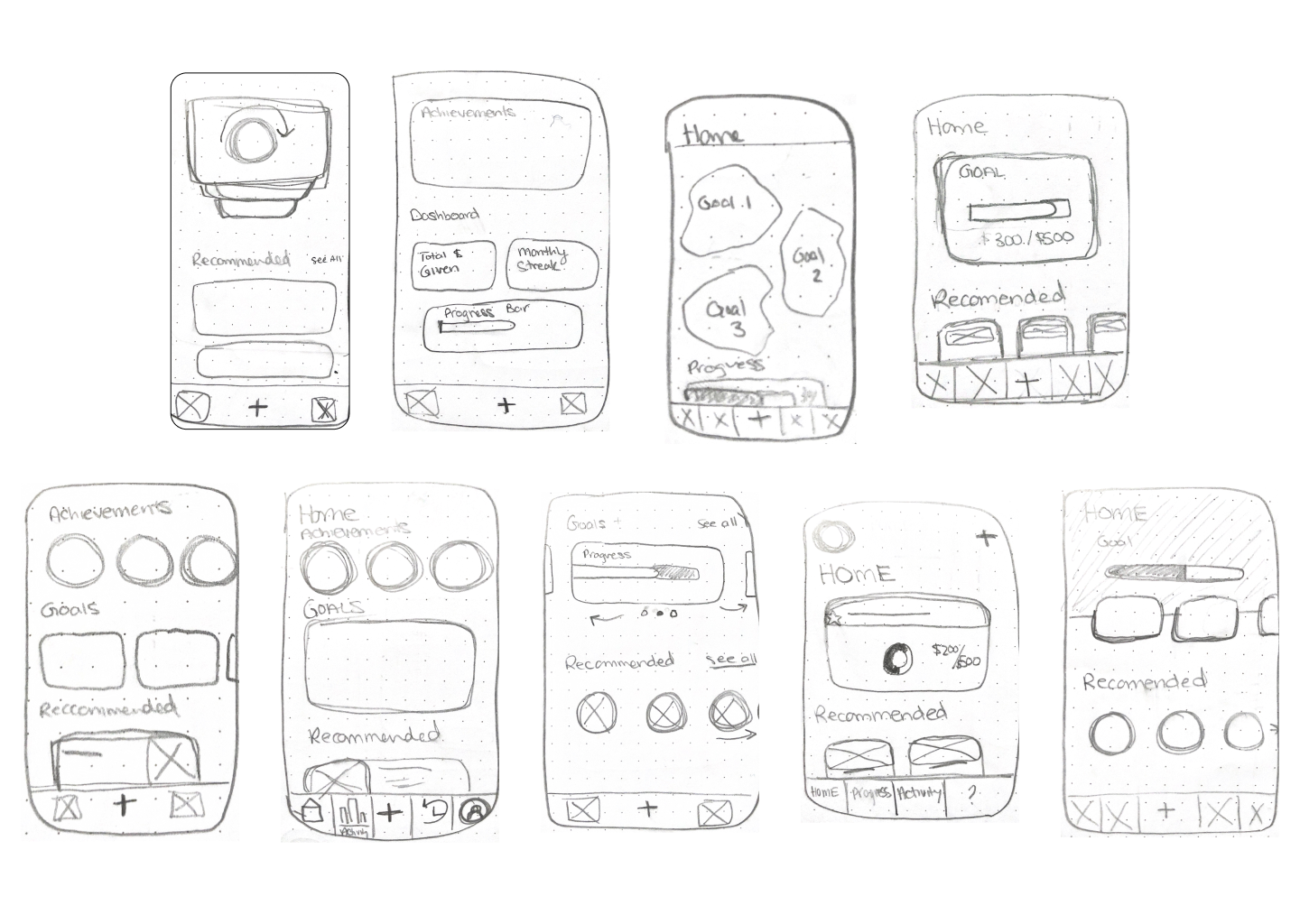
I explored multiple solution sketches for each of the pages users would encounter in the "Create a New Goal" and "Track a Contribution" task flows.
Solution Sketches to Wireframes
I selected the most compelling exploratory sketches, based on their adherence to my users' existing mental models, and translated them to wireframes. I started with lo-fi wireframes, and after adding copy, completed my mid-fidelity prototype which was ready for user testing.

Test
usability testing
Improving Designs through Testing
In order to ensure that my designs were intuitive for users, I conducted 2 rounds of usability testing, with 5 users per round. This gave me the opportunity to obtain practical, real-time feedback, which I incorporated into my designs.
Users were given the following scenario:
As an aspiring philanthropist, you want to donate more than you did last year. You want to set up a yearly contribution goal to help you stay on track and achieve your goal. After setting your goal, you were motivated to donate to an organization and want to track that contribution using the app.
Major Change 1: Track a Contribution Flow
Problem: Users weren’t immediately drawn to the “+” icon, this led to usability issues when users tried to create a new goal, and track a contribution.
Solution: In v2, I altered the “+” icon by making it larger and encircling it, in an attempt to draw the users’ attention to it. In the second round of testing, some users were still having difficulties accessing the “Track a Contribution” button. They were navigating to the progress bar on the home screen, so in v3 I introduced an alternative “Track a Contribution” flow. When users click the progress area, they're brought to the corresponding goal on the "Progress" page, where there is a large "Log a Contribution" button.


Major Change 2: Homepage Achievement Icons
Problem: Users weren’t sure what the achievement icons were when they appeared on the screen. They also tried to tap them to learn more.
Solution: In v2, I added a “New Feature” modal which appears when the user earns their first achievement. Users can also tap on the achievement to learn more about it.
Major Change 3: Edit Goals
Problem: Users wanted the ability to edit their goals and they wondered which goal would be displayed on the homepage if they had multiple goals at once.
Solution: In v2, I added an “edit” icon to the goal card, along with a pinning feature. When users create more than one goal, they could use the “star” icon to pin the goal of their choice to the homepage. I added a “New Feature” modal to inform users of this feature. However, in the second round of testing, users found this modal confusing. In v3, I removed the modal. It may be more useful when users have more than one active goal.


Refine
Brand Identity
Building a Brand
With initial testing completed, it was time to enhance the functionality of my solution using colour. I started with a mood board full of bright colours, like yellows and oranges, to convey energy, optimism and warmth. I wanted my brand fo be youthful, uplifting and engaging.


Colour and Typography
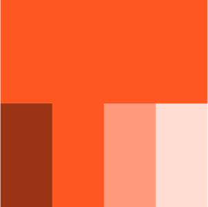
I pulled colours from my moodboard and started assembling my main colour palette. I made slight modifications to the colours to ensure they were WCAG compliant.
Primary Colour
Brand color, or essential set of colours. Used for important Call to Actions, hot spots, and other important information.
Secondary Colour
Used to accent or emphasize actions or highlighted information. This could include headings and secondary buttons.

Analogous Colour
Used sparingly and only when a contrasting, yet similar, colour is required.

Data Visualization
Used for charts, progress bars, and other data visualization.

Functional
Navigation, tables, modals, dialogs, text, links and states.

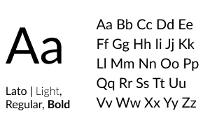
Heading Typeface

Wordmark Typeface

Body Typeface
Wordmark Exploration
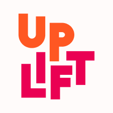
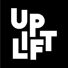
I wanted the name of this project to reflect the brand values, and inspire optimism in my users. I explored words that were positive and related to giving, philanthropy, and helping others. I settled on Uplift, which was a nod to my users who used this word to describe why giving is important.


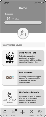
High-FIDELITY PROTOTYPE
Seeing it All Come Together
Introducing the colour palette into my grey-scale prototype was a challenge. It took several iterations to strike a balance that was appealing, accessible and functional. Taking inspiration from other apps, I also introduced more complex animations and interactions to give my prototype a realistic look and feel.
Additional Platforms
designing a marketing webpage
Communicating Value
In order to share Uplift with a wider audience, I designed a responsive marketing webpage for the app. I wanted to engage and educate users about the benefits of the app and how they can use it to give more.
Multi-Platform Solutions
Uplift on Desktop

When I consider my users' journey, there are two main channels being used. One is mobile, and the other is desktop. With this in mind, I re-imagined what Uplift could look like as a web app.
Users can still access the same features of the app, with a larger dashboard to easily view active goals, achievements, stats and insights.

Next Steps
Next Steps
Proof of Concept
One major assumption I've made throughout this design process is that Uplift will help people give more. The most important next step is testing this assumption. In order to ensure Uplift achieves its' goal, key indicators such as users' average donation amount, number of causes supported and total donation amount should be compared to national averages.
With evidence of efficacy, Uplift could seek funding and begin to expand its presence and functionality.
Potential for Growth

Linking Bank Accounts
For Uplift to be successful, users need to be consistent. One way to make it easier for users to track, would be giving them the option of linking their bank accounts to the app. When charitable contributions are detected, users would receive a notification asking them to confirm the details of their contribution.
This feature is higher risk, and users may not be willing to share their information, but for those looking for the quickest way to keep track of contributions, this may be appealing.
Social Influence
It's no secret that Millennials and Gen Z's are heavily influenced by their peers. I believe that leveraging this could also increase charitable giving.
In the future, Uplift should explore features that involve social connection. For example, inspired by Apple Watch Challenges, users may be more motivated to give if they were able to challenge and compete with peers.
Tarot cards of tech
Future Thinking

I chose this prompt because my users highly value trust, authenticity and transparency and therefore it's important that Uplift embodies those values as well.
This means ensuring that information about pay and impact are easily accessible for users, so that they're able to trust Uplift. Even during testing, some users questioned the recommended causes - they assumed they were paid ads and were distrustful towards the causes when they were meant to be inspiring.
Keeping users informed at every step of the process will give them confidence in Uplift and its mission.
Key learnings
Reflecting on the Past 10 Weeks
Trust the Process
At the beginning of this project, I had no idea how I was going to be able to come up with a digital solution that that didn't already exist. Turns out, there are problems that need to be solved everywhere, and the key is listening to your users needs and iterating, iterating, iterating. I learned to be flexible and not get too attached to my designs.
Don't be Afraid to Go Back
One step forward and two steps back usually has negative connotations, but in design I've learned that this is actually the best way to work. Getting stuck in a linear approach limits our solutions and doesn't serve our users. Our first idea is rarely our best idea so we can't be afraid to go back to the drawing board.
Pushing Myself as a Designer
The most challenging aspect of this project was designing the UI. In particular, I struggled with injecting colour and knowing when to edit my ideas. In order to grow and improve my skills I plan on really honing in on UI by incorporating daily UI challenges into my routine.

